What Colors Work with Sage Green Cabinets Designer Tips
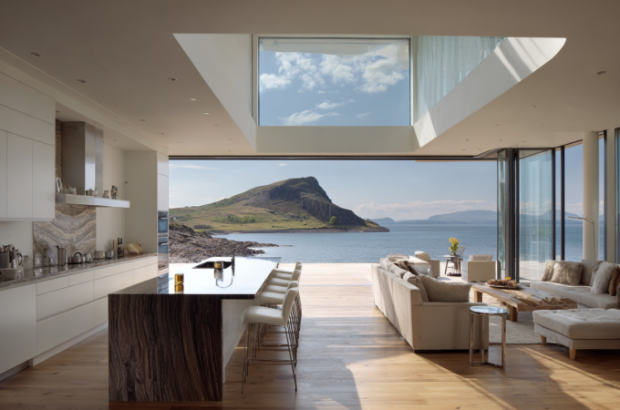
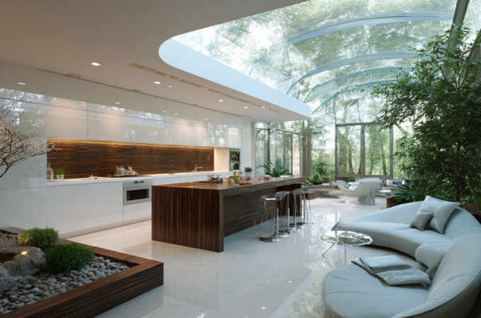
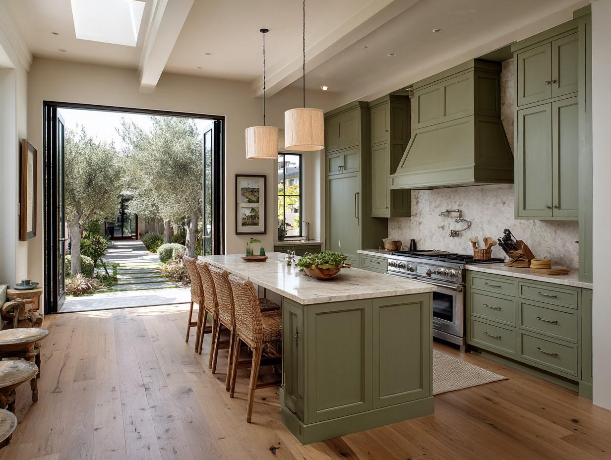
Sage green cabinets are calm, cozy, and stylish. The colour feels natural and timeless, like a soft leaf or dried eucalyptus. It works in old homes and new builds, tiny flats and big kitchens.
But the magic really happens when you pair sage with the right supporting colours and finishes. Use this guide to build a palette that’s easy on the eyes and hard to date.
Why Sage Green Is So Easy to Live With
Sage is a muted green with a touch of grey. That grey keeps it from looking too bright or childish. It also means sage can lean warm (with a hint of yellow or beige) or cool (with a hint of blue).
When you know which way your sage leans, you can pick colours that play along. Warm sages like creamy whites, camel, and brass. Cool sages love crisp whites, foggy greys, and nickel.
How to Choose Supporting Colours (Quick Rules)
- Match undertones. If your sage feels warm, keep the rest of your palette warm. If it’s cool, stay cool.
- Balance light and dark. Pair sage with one light neutral and one deeper accent so the room has contrast.
- Mix textures, not just colours. Stone, wood, tile, metal, and fabric all affect how your colours read.
- Test in real light. Paint large samples on boards and move them around your kitchen from morning to evening.
Wall Colours That Love Sage
- Soft White (warm): Think “eggshell with a drop of cream.” It brightens the room and flatters warm sage.
- Crisp White (cool): If your sage has blue in it, a clean gallery white makes it look fresh and modern.
- Warm Cream or Oat: Adds coziness without turning yellow. Great for farmhouse or traditional kitchens.
- Greige (grey + beige): The perfect middle ground when you want calm walls with subtle warmth.
- Mushroom or Putty: Earthy mid-tones that make sage feel richer, especially with wood and brass.
- Pale Clay or Terracotta (accent wall): A soft, sun-baked note that highlights warm sage and natural stone.
- Foggy Grey: For cool sages, a gentle grey keeps things airy and sophisticated.
Tip: Paint your ceiling a half-tone of the wall colour (same hue, lighter mix) for a soft, seamless look.
Countertops That Pair Beautifully
- White Quartz with Soft Veins: Clean, durable, and bright. It keeps the space light if your floors are darker.
- Marble (Carrara or Calacatta-style): The grey veining ties in with sage’s softness. Seal well for longevity.
- Butcher Block (Oak or Maple): Warm wood + sage = cozy, organic feel. Adds texture at a friendly price.
- Soapstone or Honed Black Granite: Deep, matte counters give high contrast and a classic, moody balance.
- Light Taupe Quartzite: A quiet, natural stone that bridges warm and cool palettes with ease.
Edge detail matters: A simple eased or pencil edge looks modern; a mitered thick edge feels luxe.
Backsplash Ideas That Don’t Fight Your Cabinets
- Handmade-Look White Subway (Zellige or Bevelled): The slight ripple catches light and adds depth.
- Natural Stone (Marble, Limestone): Soft veining whispers, it doesn’t shout. Keep patterns subtle.
- Vertical Stacked Tile: Modern and clean. Try a soft white or pale greige to avoid a busy look.
- Patterned Cement Tile (Muted): Choose a quiet pattern in grey/cream so the focus stays on the sage.
- Beadboard (Painted to Match Walls): Charming, budget-friendly, and great for cottages or farmhouses.
Grout tip: Use a grout one shade lighter than the tile for a calm surface; darker grout adds graphic punch.
Metal Finishes: The Jewelry of the Kitchen
- Brushed Brass / Burnished Gold: Adds warmth and glow against sage. Pairs well with creamy walls and oak.
- Matte Black: Striking contrast for modern spaces. Works with white quartz and black fixtures.
- Polished Nickel / Chrome: Cool and chic with crisp whites and grey-veined stone.
- Antique Bronze: Earthy and timeless for traditional or rustic styles.
Mixing metals? Yes—limit to two. For example, brass knobs + black sconces. Repeat each finish in at least two places so it feels intentional.
Wood Tones & Flooring
- Light Oak or Whitewashed Wood: Airy and Scandinavian. Let’s Sage the star.
- Mid-Tone Oak or Walnut: Cozy and classic; complements brass and cream.
- Herringbone or Chevron Patterns: Add movement without adding colour noise.
- Stone-Look Porcelain in Warm Grey: Durable, practical, and easy on the eye with cool sages.
Undertone check: If your floor has orange or red, balance with cooler walls and nickel hardware to avoid clashing.
Accent Colours & Textiles
- Navy or Ink Blue: Deep, tailored contrast for bar stools, runners, or pantry doors.
- Charcoal: A softer alternative to black for shelves or window frames.
- Dusty Rose or Blush: A gentle counterpoint to green; use in tea towels, cushions, or art.
- Terracotta / Rust: Earthy warmth in pottery, planters, or seat cushions.
- Mustard or Ochre: Small shots in art or a pendant shade add energy.
- Chambray or Sky Blue: Light and breezy for coastal or casual vibes.
- Natural Linen, Jute, Rattan: Texture is a “neutral” that makes every colour scheme feel richer.
Five Ready-to-Copy Palettes (With Simple Hexes)
Use these as starting points. Always test paint in your own light.
- Calm & Creamy (Warm)
- Walls: Creamy White #F5F1E8
- Cabinets: Sage Green #9BAA8B
- Backsplash: Handmade White #FAFAF7
- Metal: Brushed Brass #B08D57
- Counter: White Quartz (soft grey veining)
- Modern Contrast (Cool)
- Walls: Crisp White #FFFFFF
- Cabinets: Cool Sage #8FA59A
- Counter: Honed Black #242424
- Metal: Matte Black #1E1E1E
- Backsplash: Vertical Stacked White
- Organic Farmhouse
- Walls: Greige #E7E2D9
- Cabinets: Warm Sage #A0AE8E
- Counter: Butcher Block (Oak)
- Metal: Antique Bronze #5B4A3A
- Backsplash: Beadboard (wall colour)
- Coastal Airy
- Walls: Foggy Grey #EDEFF1
- Cabinets: Soft Sage #A6B3A0
- Counter: Carrara Marble
- Metal: Polished Nickel #C0C7CE
- Accents: Chambray Blue #7EA5C9
- Moody Classic
- Walls: Mushroom #D6CEC2
- Cabinets: Deep Sage #7C8E79
- Counter: Soapstone #2B2F33
- Metal: Aged Brass #9B7A41
- Backsplash: Honed Marble
Style-Specific Roadmaps
Modern Minimal: Crisp white walls, cool sage cabinets, honed black or white quartz counters, matte black hardware, and linear lighting. Keep lines clean. Choose slab doors or very simple Shaker.
Farmhouse Cozy: Warm cream walls, warm sage cabinets, butcher block, beadboard backsplash, antique bronze or soft brass hardware. Add open wood shelves and a vintage runner.
Coastal Light: Foggy grey or pale sand walls, soft sage cabinets, nickel hardware, marble or light quartz, and woven textures. Keep fabrics simple: linen, cotton, and stripes.
Traditional Refined: Greige walls, mid-tone sage, marble or quartzite with classic veining, polished nickel or aged brass, and detailed Shaker or inset doors. Add crown moulding and classic sconces.
Moody Heritage: Mushroom walls, deep sage, soapstone or dark quartz, mixed brass and black hardware, and warm walnut floors. Use dimmable lighting and library-style pulls.
Lighting: The Silent Colour Changer
Why Light Changes Colour
Light temperature and direction shift how sage reads. North light is cool and makes sage look grayer; south light is warm and adds yellow. Morning light is soft; evening light deepens shadows and can muddy tones.
Natural vs. Artificial
- Daylight: Sky-heavy rooms tilt cool; balance with warmer paints or brass.
- LEDs: Use 2700–3000K for cozy kitchens, 3500K for clear task zones.
- CRI (color rendering index): Aim for 90+ so paint, wood, and stone look true.
Designer Tips
- Test large swatches on boards; move them around all day.
- Layer light: ambient, under-cabinet task, and small accents.
- Add dimmers to keep sage the rich at night.
- Warm floors? Use cooler bulbs. Dark counters? Boost task lighting.
Small Kitchen Tricks
- Keep contrast high: Light walls + sage lower cabinets + light counters make the space feel larger.
- Gloss where it helps: Satin on cabinets hides fingerprints; a subtle sheen on backsplash bounces light.
- Glass doors or open shelves: A few can break up heavy runs of colour.
- One star only: If the cabinets are the star, keep tile and counters quiet.
Common Mistakes to Avoid
- Too many greens. If your splash, rug, and decor are also green, the room can feel flat. Add wood, white, or a dark accent.
- Clashing undertones. A pink-beige floor with cool sage can look off. Fix with a warmer wall or brass hardware.
- Busy patterns everywhere. Choose one area for movement (veined stone or patterned tile), not both.
- Forgetting the ceiling. A slightly warmer or lighter ceiling colour softens the room and helps the sage sing.
- Ignoring grout and trim. These “small” colours tie everything together. Keep them consistent across zones.
A Simple 7-Step Plan (Follow This Order)
- Confirm undertone of your sage (warm or cool).
- Pick the wall colour that flatters it in your actual light.
- Choose the countertop (light, mid, or dark) for contrast.
- Select the backsplash for texture, not just colour.
- Lock in metal finishes (one warm, one dark or cool).
- Check floors and wood tones so undertones don’t clash.
- Layer textiles and accents (one deep colour + natural textures).
Final Word
Sage green cabinets bring nature’s calm right into your kitchen. They’re soft enough to feel timeless and strong enough to set the mood.
Pair your sage with a supporting cast of balanced neutrals, smart contrast, and honest textures. Test in real light, keep the palette focused, and let one or two materials shine.
Do that, and your kitchen will feel welcoming, fresh, and beautifully pulled together—today and years from now.