Free color analysis test: step-by-step guide and AI vs. traditional methods
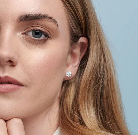
A color analysis test free is a sort of online or printable quiz that categorizes your top colours by skin, hair and eye tones, frequently into seasons such as Spring, Summer, Autumn and Winter. Most tests seek undertone clues–cool, warm or neutral–and then pair you with distinct palettes like cool berries, warm earths, soft pastels or deep jewel tones.
Great tests provide immediate results in less than 5 minutes (you can use Color Analysis Pro test for example) and feature swatch guides you can download to your phone. The free versions are less detailed, but many still recommend hex codes, outfit tips, and in day light makeup notes.
For a streamlined launch, the quick guide below illustrates how to select a reliable test, interpret results, and apply them in everyday wear.
What is Color Analysis?
A foolproof way to identify the colors that flatter you most by analyzing your skin tone, undertone, hair and eye color. Color analysis, known as seasonal color analysis, categorizes you into palettes so your clothes, makeup, and accessories compliment your natural appearance. Free color analysis quizzes and tools direct you to a ‘season,’ which enhances confidence and reduces guesswork.
1. The Theory
Seasonal color analysis draws from color theory: hue (the color family), chroma (how clear or muted), and value (how light or dark). It combines these with your inherent contrast, so your palette comes across as balanced — not shrill or muted.
It applies art theories to connect individuals with palettes that have comparable warmth and sharpness. Primary colors are important because they ground hue shifts. Undertones indicate warmth or coolness.
Contrast–how your hair, skin and eyes vary in value–creates depth. A quick chart helps: along one axis, value from light to deep; along the other, chroma from soft to clear; overlay warm to cool. Where you fall suggests a color palette.
2. The Undertones
First check your undertone. Look at vein color in natural light: green hints warm, blue or purple means cool, mixed reads neutral. Observe your natural hair color and skin’s sun reaction.
Gold jewelry flattering could suggest warm, silver could suggest cool. Undertones guide selections in both fashion and cosmetics. Warm types tend to glow in peach, coral, olive, camel.
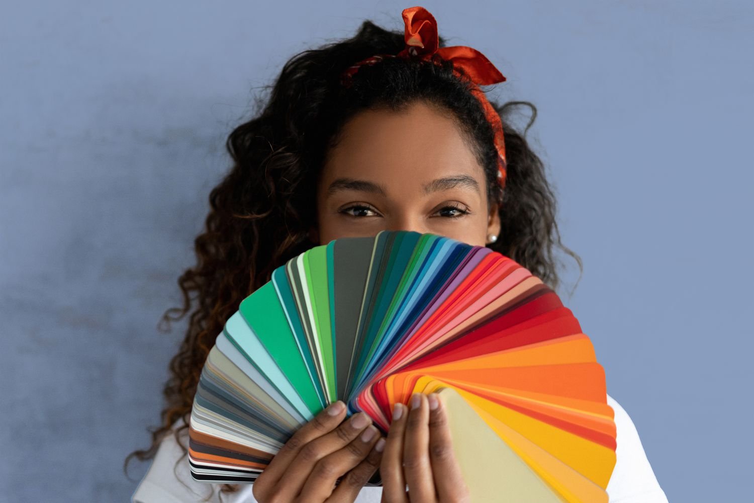
Cool types appear crisp in berry, charcoal, emerald, icy pink. Neutrals cover a greater spectrum, typically the ‘universal’ shades such as teal or ivory. Test swatches by the face, use a color analysis kit or online color picker. Photograph in the shade so we can see clearly.
3. The Seasons
Four seasons–Spring, Summer, Fall, Winter, expanded to 12 palettes via sub-groups such as Light, True, Soft or Deep, Cool, Clear.
Spring: warm, light, clear; think light spring’s airy hues and true spring’s bright corals. Summer: cool, light-to-soft; dusty rose, soft navy. Fall (Autumn): warm, rich, muted; rust, olive, mustard.
Winter: cool, deep, clear; black, cobalt, fuchsia, deep winter’s intense contrasts. A seasonal color analysis quiz or palette page lets you test traits and hone your category.
4. The Goal
It’s a closet/cosmetics bag/accessories drawer color palette that makes you look healthy, vibrant, and put-together. Wear colors that lift your face and reduce redness and brighten eyes.
Confidence comes when decisions feel effortless. Develop a capsule wardrobe by limiting yourself to your season’s neutrals and a small handful of accents. Apply the same concept with lipsticks, blush and frames!
Color analysis may not be a precise science, but it makes shopping and styling easy.
Your Free Online Test
Free color analysis tests and quick quizzes abound online, and many tools provide immediate feedback. Others employ AI, selfie uploads, or color-analysis cameras that scan pigments from your face. They want to categorize you into one of 12 seasons types—there are three variations of each of the four seasons. Our recommendation is Color Analysis Pro as a service for color analysis.
Preparation
Take a crisp selfie in soft natural light, next to a window, around noon. Forget makeup, tints, self-tan, and filters. Tie hair back if it’s dyed, or cover with a white towel, so it won’t bleed color on skin.
Have your basics ready: natural hair color (not dyed), eye color details (patterns, flecks, depth), and skin tone notes (fair, medium, deep; cool, warm, or neutral). Freckles, porcelain or ivory skin, and visible flush can all count.
Go with a simple white or grey shirt. Take off those bold scarves, colored-framed glasses and bright earrings that shine on your face.
Don’t be surprised if they quiz you on your color personalities and where you feel shades! You can even score how your skin responds to sun and what metals suit you best.
Execution
Proceed through the quiz/color picker one screen at a time. READ prompts twice, a lot of the tools DIFFERENTIATE undertone from overtone.
Upload your selfie if requested, or type in details by hand. Certain AI utilities connect pixels from cheeks, lips and eyes to predict how cool or warm a person is.
Use picker buttons to correspond with your hair (ash brown v golden brown), eye ring (clear, soft or muted) and skin cast (rosy, golden, olive). Choose the nearest color, not the most attractive.
Finish all sections: hair depth, eye clarity, and undertone. If you’ve changed hair color over time or your skin has shifted with age or sun, mark it down—this can tip you back and forth between, for example, Bright Winter and Cool Summer.
Submission
Proof your answers for typos and lighting problems prior to submitting. Instant dashboards tend to display your seasonal family, best neutrals and accent colors.
Download your palette to shop or pack. Some folks receive varying results on multiple attempts—one individual had it three times and received three types.
Others whittle it down to a handful, not certain. Dark hair and eyes might indicate Winter or Autumn, lighter hair and eyes tendency toward Summer or Spring.
Fair, freckled, ivory skin can read cool or neutral. Hair or skin changes over the years can move you into a different season. A lot take the test for kicks, some discover it useful, others remain uncertain.
AI Versus Human Eye
Color impels decision rapidly—something like 90% of first impressions depend on it—thus an gratis color analysis that rings true is important. AI tools and human analysts tackle that objective in different ways, and each excels under different circumstances.
The Algorithm
On the AI side, color analysis maps pixels from a selfie to these color spaces, then compares those values to the seasonal palette rules. It interprets undertone and value (light to dark) and chroma (soft to bright) on the basis of image processing and rudimentary color theory.
If the photo is clear, the math can be clean. Speed is the attraction. Upload a selfie, receive a personalized palette in seconds, frequently complete with sample swatches and hex codes you can use for online shopping.
Some users go as far as reporting the same season from a few different AI tools and a pro, which establishes trust. Outputs dependence on inputs. Natural light by a window, no makeup, no colored contacts, and a neutral white balance on a camera help.
Bad light, harsh filters, colored hair, or low-res images can distort undertone and value. If you’re a novice, begin with a free or inexpensive AI quiz (many cost €10–€45, about $10–$50). Consider it a first pass, not the final word.
Try the palette with a T‑shirt or scarf and observe how skin appears—fresh or dull.
The Expert
A seasoned analyst reads beyond pixels. They notice texture, feature contrast, and the way skin responds as drapes move from cool to warm, soft to bright. That immediate response is difficult to counterfeit.
In human colorimeters, they employ fabric swatches, controlled light and guides. You see your face transform in real time, not just the picture. Human judgment assists in nuance—bleached hair, combination undertones, freckles, dark melanin, societal beauty signals and individual flair.
Some folks don’t live in one neat season — they mix. A pro can construct a hybrid palette that still senses cohesive. If AI findings conflict with your daylight appearance, or you’re stuck between seasons, schedule an in-person session or virtual consult that verifies your natural coloring in multiple lighting.
The Verdict
- AI pros: fast, consistent, accessible, low cost, easy for global use.
- AI cons: photo-dependent, prone to bias, struggles with hybrids, lighting-sensitive.
- Human pros: nuanced, context-aware, tailored palettes, live testing across lights.
- Human cons: higher cost, limited access, variable wait times, subjective.
Best path: use AI for direction, and an expert for depth.
Decoding Your Palette
It decodes how your skintone, eye color and hair color combine with hue, value (light-dark) and chroma (soft-clear). Outcomes frequently refer to seasons—Spring, Summer, Autumn, Winter—and subcategories such as Soft Summer or Deep Winter. It’s not always tidy.
Hair may relocate every 7 years, gray may invade and rival analysts interpret the very same visage in another manner. Consider your complimentary test a robust sketch, then polish it with live experiments.
How to read seasonal results and nuance
Begin with your season’s essential characteristics. Winters are cool, high contrast and clear. Summers are cool and tender. Hermes autumns are warm and rich. Springs are toasty and sunny.
Subcategories narrow the mix: Deep Winter loves cool, dark, high-contrast colors (ink, icy pink), while Soft Summer thrives on cool, muted blends (dusty rose, slate). If you have dark hair and eyes, you could be a Deep Winter but a warmer skin cast can pull you into Deep Autumn.
Fair skin with freckles and neutral undertones tends to muddle the call; you could fall somewhere in between Light Spring and Soft Summer. Gray hair can sharpen cool types (Cool Winter, Soft Summer) but can wash out warm types unless they deepen makeup or clothing contrast. Anticipate some argument. Support any label with the way your skin looks in the mirror.
Steps to pinpoint best colors
- Gather data: shoot photos in daylight wearing a white tee, then drape pure hues—true red, cobalt, teal, camel, charcoal. Observe skin clarity and eye brightness.
- Check undertone: place cool silver vs warm gold near your face. Observe for consistency, not bias.
- Test value and chroma: try light vs deep (icy blue vs navy), then soft vs clear (sage vs emerald).
- Build keepers: list 8–12 colors that smooth skin and make eyes pop.
- Stress-test: wear two full outfits from the list for a day each. log comments and how your skin holds up.
- Revisit season: align your keepers with a season/subtype; embrace a “border” identity when necessary.
- Update for change: repeat steps after hair shifts, including going gray.
- Seek a second view: take two more quizzes or ask a specialist. Take results as hints, not commandments.
Put it to work
| Neutrals | Main Colors | Accents | No-Go |
The Inclusivity Problem
Quick color tests dangled for free offer fast solutions but tend to overlook real-life diversity. A lot of POC get mislabelled—Black users jammed into Winter or Dark Autumn with minimal subtlety. Standard techniques highlight primarily white, blonde specimens, so expansive shades get pushed aside.
Others aren’t even draped, which eliminates a crucial step for scanning subtext in the moment. Tools require improved data, more flexible categories, and space for individual flair.
Algorithmic Bias
AI tools learn from what they see. If training images tilt light-skinned, blonde, and cool-leaning, the model brings those presets into every quiz. It presumes some subtext trails and promotes outcomes that match its limited guide.
That bias surfaces in strict palette requests for unconventional coloring, such as deeper skin with warm-gold overtone and cool olive undertone, or dark hair and high chroma eyes. A lot of Black and Asian users report that the outputs default to grouping them with Winter, even when softer, brighter, or warmer palettes suit them better in reality.
Developers ought to expand datasets across skin depth, undertone blends, hair textures and age, and push test edge cases. Mix Western and Korean systems, as the Korean system tends to read higher pigmentation better.
Users can help themselves too: cross-check AI with a manual quiz, in-person draping if available, or advice from trained analysts who work with diverse clients.
Lighting Variables
Light transforms all. Direct sun makes colors look sharper and cooler, warm bulbs push skin red or yellow, mixed light confuses the camera.
Employ soft, indirect daylight by a window, mid-morning or late afternoon. Look toward the light, maintain a simple background, and ditch the heavy makeup. That arrangement reduces dissonance.
Shadows and glossy walls and auto white balance can move how skin and hair read. Even a phone’s beauty filter, which mutes contrast and fools the test. If your result seems funky, shoot again with two or three lighting configurations and compare.
Cultural Nuances
Color is significant. Red might indicate fortune somewhere, elegance somewhere else. Palettes that disregard context shove colors folks won’t wear, regardless of how “right” on paper.
Old seasonal theory, constructed and cemented in Western cultures, does not translate directly to worldwide colorings, characteristics, or styles. That gap is why social posts of non-white users post mislabeled and fixed, and why some test on their own—swatching paint on skin or at-home draping of bright scarves.
Tools need to inject cultural annotations and elastic ranges, not merely seasons. Excitement is increasing for systems matched to Black and Asian populations, the Korean model referenced as more accurate for darker skin tones.
Yet, tons don’t cleanly fall into any season—they hover between palettes and require a custom blend that respects individual taste, modesty requirements and workplace conventions.
Beyond The Test
Color analysis provides a guide, not a prescription. The true benefit is in real life evidence, regular adjustments and a closet that evolves as you do.
Verify
Begin with fast, actual tests. Stand by a window at noon. Hold a few swatches near your face – soft white, cream, charcoal, navy, tomato red, berry. Look out for brighter eyes, smoother skin and reduced shadowing.
If a shade accentuates dark undereye circles or skin that looks lackluster, save it. Request basic feedback from those who observe you regularly. ‘Do I appear fresher in this blue or this green?’ Capture notes or photos on your phone in the same vein. Mini patterns pop up quickly.
Utilize tools if you’re a techie. Virtual wardrobe apps or a color picker can flag undertones. Experiment with a vibrant scarf or crimson lip for a day, then a toned down choice the following day. Keep track of which one generates more confidence and compliments. Your gut counts as well.
Narrow the palette. Most “winters” steer clear of orange but a few can carry off deep coral. Exchange what flops, maintain what uplifts your face.
Integrate
Draw your top colors into the pieces you actually wear—tees, shirts, knits, outerwear. Maintain undertone-appropriate neutrals — cool charcoal, warm camel — then accessorize with 2-3 accents you adore.
Build a small capsule to test: one jacket, two bottoms, three tops, one dress, two pairs of shoes, a bag, and a scarf. Choose colors that blend. Navy + soft white + teal Charcoal + blush + berry. Fewer decisions, more simplicity.
Shop with your palette. Just save it as a photo. Check fabric in daylight if you can, or request a video from the seller. If a color doesn’t match but still flatters, mark it as a “proxy” shade.
Makeup refresher with a couple of swaps. Cool pink or berry for lips if you lean cool, warm rose or terracotta if you run warm. Match blush to lip depth. For eyes, attempt taupe, slate, or espresso instead of harsh black for day.
Evolve
Re-establish your palate annually or after new hair, more sun, skincare shifts. What worked with dark hair might need lighter contrast if you go gray.
Test trends as accents, not anchors. A lime belt, a copper liner, or a saffron knit can rejuvenate staples without a complete pivot.
As your eye trains, cut boldly. Retire what weighs you down. Maintain a shortlist of ‘instant-win’ colors for those rapid mornings. Own a signature hue, then let it shift when you do.
Conclusion
To conclude, color analysis ought to be clear and practical. A free test gets you off to an expedient start. AI assists with velocity. To a trained eye, it adds nuance. Both can be fruitful.
To wit smart picks, trace what tones illuminate your countenance. Remember a couple of victories. Navy with soft white. Olive with cream. Berry cocoa Tiny tests generate confidence in your vision.
For a fresh and broad perspective, look for resources that identify more than four seasons. Seek out brands that represent diverse skin tones and undertones. Real reach real people.
To maintain progress, screenshot a couple pictures, jot notes, and adjust. Style comes with evidence.
To go a step further, pair one free test, then test a shade in real light today.
Frequently Asked Questions
What is a color analysis test?
A color analysis test guides you to the shades that compliment your skin tone, hair and eyes. Other color analysis test free will tend to group colors into seasons or tonals. It’s to simplify your shopping and increase your confidence in making better color choices.
How accurate are free online color tests?
They’re nice for a jumpstart but not ideal. Lighting, cameras, filters can all slant results. Treat them as a roadmap, not a destination. Verify with natural light and fabric swatches if you can.
Should I trust AI or my own eye?
Use both.AI provides quick, data-based recommendations. Your eye verifies what’s right in real life. Try colors out in daylight on your face. If a shade lightens you and minimizes darkness, it’s successful.
What do seasonal palettes mean?
Seasonal palettes categorize colors based on temperature (warm/cool), value (light/deep) and chroma (soft/bright). For instance, ‘Summer’ leans cool, soft and light. This structure limits options and accelerates decisions.
Can color analysis be inclusive for all skin tones?
Yes. These modern methods take into account all different undertones and depths. They eschew restrictive tags. Seek out tools and professionals that test on multiple skin tones and provide transparency in their methods and sample data.
How do I decode my results into real outfits?
Begin with your neutrals (navy, charcoal, cocoa). Add 2-3 accent colors from your palette. Construct a mini capsule wardrobe. For maximum impact, test with tops near your face first.
What should I do beyond the test?
Confirm in daylight, test fabric drapes, compare before & after photos. Follow compliments & your feelings! Make adjustments as you go. If necessary, schedule a professional consult.