What Makes Dark Brown Kitchen Cabinets Look Elegant Instead of Old-Fashioned
Two kitchens can have the exact same dark brown cabinet color and still feel nothing alike. One reads like a moody wine bar where everyone wants to linger.
The other feels like a dentist’s waiting room from 2004.
Same basic color, opposite vibes. So why do some dark brown kitchen cabinets look rich while others look stuck in the past? It isn’t luck, and it isn’t a giant budget. It comes down to a handful of choices: the undertone, the sheen, the door profile, the hardware, the light bulbs, and what sits on top of and around the boxes.
Get those right and dark wood reads warm and calm. Get them wrong and the room starts asking if you still have a fax machine.
This guide walks through each choice so you can spot the difference fast and pick a look you will still love in ten years.
Why Some Dark Kitchens Feel Stuck in Time
Plenty of homes built or remodeled in the late 1990s and early 2000s got the same recipe: reddish cherry cabinets, speckled dark granite, and warm, yellowish lighting. Hunker describes that smooth-grained cherry look as a high-end choice in the ’90s, and notes that dark countertops and yellow-toned lighting make the effect heavier.
So the trouble was never “dark.” It was a few things stacked together:
- A red or orange undertone that clashes with today’s cooler grays and warm whites
- Dark, busy granite that merges with the cabinets into one big brown block
- Dim, yellow light that flattens the wood grain
- Ornate doors with lots of curves, arches, and applied trim
- Shiny brass or brushed nickel pulls that scream “builder package”
Notice that only one of those items is the cabinet color. The rest is styling. That’s good news, because styling is the part you control.
Pick the Right Undertone First
Brown is never just brown. Every dark brown leans somewhere: red, orange, yellow, green, or gray. That lean decides most of the mood.
Cool and earthy browns feel current
The browns that look fresh right now tend to sit closer to taupe, bronze, or espresso. Sherwin-Williams named Urbane Bronze (SW 7048) its 2021 Color of the Year, and it’s a good example of a brown that borrows a little gray. It reads sophisticated instead of cozy-cabin. Sherwin-Williams itself suggested pairing it with Modern Gray (SW 7632), which tells you how well it plays with soft neutrals.
Benjamin Moore offers several deep browns worth sampling too. Hearthstone Brown (2109-20) has an LRV of 8.8, which means it reflects very little light, and the brand calls it a go-to dark brown for a welcoming feel. French Press (AF-170) and Wenge (AF-180) are other rich options in the same family.
Stained wood follows the same rule
If you want real wood grain instead of paint, the logic carries over to stain. Minwax sells interior oil-based stains like Espresso and Dark Walnut, and both are labeled for cabinets, trim, and furniture. Espresso is a deep, rich brown that still shows the grain. Dark Walnut can come out darker than people expect, so test it on a hidden spot or a scrap board first.
The quick test: hold your sample next to a white sheet of paper. If it looks red or orange, it will probably drift toward that early 2000s mood. If it looks like coffee, chocolate, or bronze, you’re on the right track.
Finish and Sheen Change Everything
Gloss is the sneaky detail most people forget. A high-gloss dark brown can look like a grand piano in the right modern kitchen, but in most homes it shows every fingerprint and feels a bit flashy.
A matte or satin finish usually looks more expensive on dark cabinets. It softens reflections, hides small scratches, and lets the color feel deep instead of slick. On stained wood, a low-sheen topcoat lets the grain do the talking. Think of it like a good leather jacket. Nobody wants it shiny. They want it to look broken in and expensive.
Door Style Sets the Era
If the color is the voice, the door style is the accent. It tells people when the kitchen was born.
Shaker and slab doors keep it clean
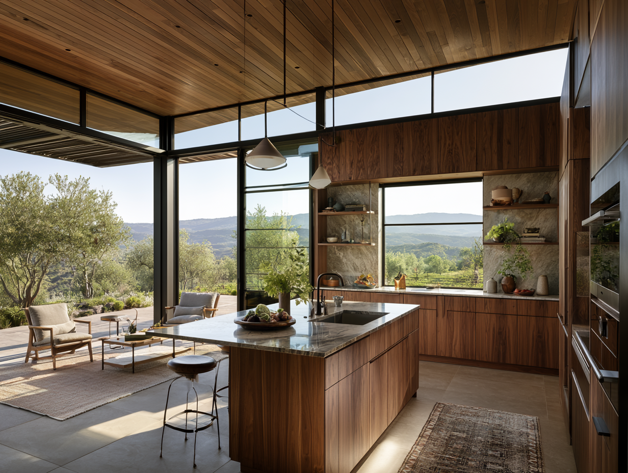
A simple Shaker door, with its flat center panel and square frame, is the safest way to make deep color look current. It’s classic without being fussy. Flat slab doors go even more modern and work great with a rich wood veneer that shows long, straight grain.
Raised panels need a lighter touch
Raised-panel doors with cathedral arches and rope trim are a big reason older dark kitchens feel heavy. All those curves and shadows pile up when the color is already deep. If you love a traditional look, try a simple raised panel with square edges and skip the extra molding.
This is the point where most people start scrolling through door samples, and that’s the fun part. Browsing a few styles of dark brown kitchen cabinets side by side makes it easy to see how a flat Shaker panel and a curvy arch change the whole personality of the same color.
Give Dark Brown Kitchen Cabinets Some Contrast
Dark cabinets need something to push against. Without contrast, the room turns into one big cave. With it, the wood suddenly looks intentional and rich.
Counters do the heavy lifting
Hunker’s advice for updating dated cherry kitchens is simple: swap dark counters for white ones. It says granite or engineered quartz in a light color can still match the warmth of the wood, and that subtle gray veining adds interest without fighting the grain. A white or cream quartz with soft veins is a reliable partner for nearly any deep brown.
If white feels too stark, warm options like creamy marble-look quartz or a pale limestone tone keep things soft. What you want to avoid is the busy, speckled dark granite that blends into the cabinets.
Backsplash adds texture
A backsplash is your chance to have a little fun. Glossy white or cream tile reflects light back onto dark boxes, which keeps the room bright. Handmade-look zellige tiles add a slightly wavy, shimmering texture. A tall slab backsplash in the same stone as the counter looks especially calm and high-end.
Walls and floors matter too
Pale walls in a warm white or soft greige help dark cabinets stand out. Floors can go lighter or match the mood, but try to avoid a floor that’s the exact same brown as the cabinets.
Hardware: The Jewelry of the Kitchen
Hardware is small, but it’s the part your hand touches every single day, and it changes the look more than its size suggests.
Brass is having a moment again. Houzz notes that satin brass hardware pairs well with dark cabinets set against white or gray walls, and a designer there credits its comeback to the fact that it feels new after years out of favor. A brushed or aged brass finish looks warmer and less flashy than the bright, polished brass of the 1990s.
Other finishes that work well with deep brown:
- Aged or antique brass for warmth and a vintage edge
- Matte black for a clean, graphic look
- Oil-rubbed bronze for a soft, tone-on-tone feel
- Polished nickel for a slightly glam, traditional style
Size matters too. Longer, slimmer pulls on drawers look modern. Small knobs on upper doors keep things light. For a finished look, repeat the hardware finish at the faucet or the light fixtures so the room feels planned.
Get the Lighting Right
You can choose the perfect brown and still lose the battle to a bad light bulb. Dark surfaces absorb light, so they need more of it, and the color of that light matters.
Pick a warm but not orange color temperature
Light bulbs are rated in Kelvin. Lower numbers glow warmer and more yellow. Higher numbers look whiter and cooler. Most home lighting sits between 2700K and 3000K.
For kitchens, the lighting retailer LEDCO calls 3000K the most versatile choice because it stays warm without turning counters yellow. Test your bulbs against a real cabinet door before you buy a whole box, since dark wood shifts more under different light than pale finishes do. Warmer 2700K bulbs can still be lovely in an open dining area where coziness wins.
Layer your light
One big ceiling fixture won’t cut it with dark cabinets. Try layers:
- Recessed or ceiling lights for overall brightness
- Under-cabinet strips to light the counters and show off the backsplash
- Pendants over the island for style and focused light
For prep areas, some guides suggest a slightly cooler 3500K to 4000K so you can see what you’re chopping. Hunker also points out that crisp LED under-cabinet lights bounce off light counters and make the whole space brighter, which is exactly what dark wood needs.
Mix in Lighter Elements
You don’t have to make every cabinet dark. In fact, mixing tones is one of the easiest ways to look current.
A popular move is two-tone cabinetry: dark brown on the lower cabinets or the island, and something lighter up top, like a cream paint, natural oak, or open shelves. The darker color grounds the room while the lighter tops keep it from feeling heavy. You can also do the reverse, using dark wood only on a big pantry wall as a statement piece.
Glass-front upper doors help too. They break up a long run of dark wood and give you a spot to show off nice dishes.
FAQ
Are dark brown kitchen cabinets going out of style?
Darker woods are seeing a return, and some sources note that traditional wood tones never left in many regions. What feels dated is the specific early 2000s recipe of red stain, dark granite, and dim yellow light, not dark brown itself.
What countertop goes best with dark brown cabinets?
Light counters give the most contrast. Hunker recommends white granite or quartz, and soft gray veining adds interest without competing with the grain.
Do dark cabinets make a small kitchen look smaller?
They can if the room lacks light and contrast. Pair them with light counters, a bright backsplash, good under-cabinet lighting, and lighter upper cabinets, and a small kitchen can feel cozy instead of cramped.
Should I paint or stain dark brown cabinets?
Paint gives you a smooth, solid color like Urbane Bronze or Hearthstone Brown. Stain keeps the wood grain visible, like Minwax Espresso. Both can look elegant, so it comes down to the texture you prefer.
The Secret Is in the Details
Dark brown isn’t the problem. It never was. The kitchens that look tired usually got a few details wrong at the same time, and the ones that look stunning got those same details right.
Choose a brown that leans toward coffee or bronze instead of red. Keep the sheen soft and the door style simple. Give the cabinets something light to contrast with, pick hardware that feels like jewelry, and light the room with warm bulbs around 3000K. Mix in a lighter element or two so the space can breathe.
Do that, and your kitchen lands firmly in wine-bar territory. No fax machine required.