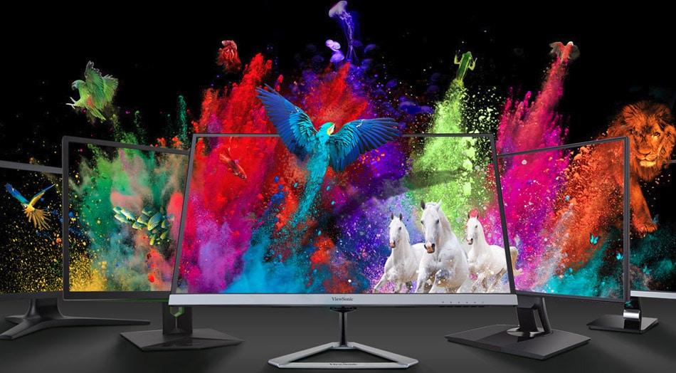
High Color Contrast For Maximum LED Display Visibility
COLOR COMBINATION of the outdoor LED display is one of the biggest mistakes most people make while buying. We know that the LED lighting solution is on the rise for promotions. Thus, many other options are available in the market. But LED display screen is one of those options that are most affordable. However, due to this energy efficiency quality, the market is adopting this option swiftly. But people don’t notice how the color combination can make an impact. So, we need to learn more about this to get full advantage.
How contrasts make a difference in outdoor LED displays?
Did you ever notice what will happen if you surround the same color yourself? Yes, things will look dull, and it will not attract people. However, this is the same case in outdoor LED displays. The main aim of the digital screens is to get the public’s attention. But if you use neutral or dull colors, then it will not create the right contrast. Moreover, there are the following benefits of using high color contrast for the outdoor LED display.
- It will be a lot easier for the passersby to read and comprehend
- Moreover, it is a great way to stand out LED signs among the masses.
- As a result of using high contrast colors, you can attract masses from a distance.
If you choose to use high contrast colors, it will ultimately bring customers to your business. But, by choosing dull and low colors, your text will blend with the base and won’t get attention.
Proper Outdoor LED display distance:

A business needs to spread the business message to most people. So, the following chart is advising the best distance with high contrasting colors for better visibility.
| Letter Height (Inches) | Best distance per feet | Maximum readable length should be (feet) |
| 3 | 30 | 100 |
| 4 | 40 | 150 |
| 6 | 60 | 200 |
| 8 | 80 | 350 |
| 9 | 90 | 400 |
The best color contrasts for outdoor LED display:
If you don’t know how colors work together, you surely need to read this guide to understand what is essential. So, at the first step, here are certain things that you need to consider before deciding the colors.
- Firstly, determine the place where you are going to install LCD or LED display.
- Now make sure that the combinations that you are using are easy to read even from a distance.
- The highest readability comes with a brightness difference of 70% or more. However, it means that light and dark color makes the best combination for maximum visibility.
However, the question is which color contrast is best for outdoor LED display to get maximum visibility. So, the following chart has some colors that make the best combinations.
| Black on yellow | White on black | Yellow on black |
| Black on white | Blue on white | White on blue |
| Blue on yellow | Yellow on blue | Green on white |
| White on green | Red in white | White on red |
| Red in yellow | Yellow on red | And other colors with a lighter and darker combination. |
Note: If you choose light colors, you can strengthen them by using an outline or drop shadow. In this way, you can maintain the contrast despite fading due to weather or other effects.
Don’t use light colors:
We mentioned earlier that light colors could fade quickly. So, it’s a wise decision if you don’t choose light colors in the background. As a result of this mistake, your text will blend with the front color. Ultimately it will affect readability put a negative impact on a marketing campaign. Please don’t use the same colors as orange and yellow because they are similar and blend.
Go for the high contrast colors:

Right color combinations can bring more customers to the business. According to “Outdoor advertising association” high color contrast can improve outdoor campaign recall by 38%. So, always use eye-catching and vibrant colors at outdoor LED displays. Apart from this, before deciding the color combination, consider the place where you will display the screen. Thus, some of the best color contrasts are like:
- Blue on yellow
- Yellow on black
- Black on white
- Or white on black etc.
However, if you don’t want to use vibrant colors, go for the color-border options. In this way, you can create a tasteful impact by using sober colors. But high contrast colors are those that always get the most attention and bring more benefit. Moreover, don’t forget to use 30%-40% of white space to prevent visual clutter, that impairs readability.